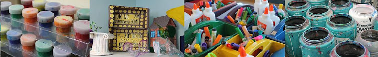


So the first set of materials I decided to try out was the Prang vs. RoseArt markers. As I continue through my post below, I'll show you some photos behind my notes here, but these are my thoughts about the markers:

- Prang
- 12 colors (+)
- Colors are more concentrated and solid (+)
- Bleed through 80 lb. paper when used heavily (-)
- White caps = no mixed up colors (+)
- Tips seem strong (+)
- Prang Power points! (+)
- $4.00 (Office Max), $2.89 for set of 8 and $3.95 for set of 12 through Blick
- Rose Art
- 10 colors (-)
- Less concentrated, more transparent (-)
- Don't appear to bleed through 80 lb. drawing paper when used heavily (+)
- Colored caps = mixed up colors (-)
- Tips seem flexible (-)
- $4.57 (Amazon), $2.20 through Rose Art
When it comes to markers, I have a few different kinds I generally use in my classroom. I have the Crayola markers for everyday use in the supply bins in the elementary room. I can definitely say that I agree with Mr. E. when he says the Crayola markers tend to be "sketchy" when coloring a large area. That is why I let the kids use those ones for free draw. I actually use the non-scented Mr. Sketch markers for specific projects that require a nicer marker (I prefer the chisel tip for thick and thin lines, though the younger kids do need to be taught how to use those markers correctly), and I use the obvious Sharpie marker for specific projects as well. Currently, I'm not really sure where I'd stand on buying Prang markers. If they were offered in a requisition cheaper than Crayola, I'd probably try them, but currently I've got a good stock pile of the others!

Now, they also sent Ticonderoga pencils, and there really is no contest there between the competitors brand. I already purchase these through my Boces requisitions each year. They're strong pencils, the erasers are good (while they last), and I appreciate that this pack already came sharpened, although the 12 packs I purchase are not sharpened.
So, onto the bulk of this post. Because of the Common Core, I was asked if I had a textbook in the art room to use. This Art Talk textbook is the textbook art teachers in St. Lawrence county agreed to use many years back, around 2000 I believe, as that is the copyright on this textbook, but at recent regional meetings, it's apparent that everyone does not use it anymore (granted, I'm sure that will now change again with Common Core rolling in). It's an okay book, but I definitely don't plan on using it from start to finish for the entire year. I'll use bits and pieces here and there as they fit what the students and I want to do over the school year and then I'll possibly look into a different textbook for next year.

My first unit is actually going to be pulled directly from the textbook, but with my own twist on the notes, quiz, worksheets and projects. I know a lot of students tend to be bored by the elements and principles, so I want to get that out of the way right in the beginning, and hopefully make it quick and somewhat fun. The projects suggested in the textbook to do all revolved around critiques and discussions in some way, which seems very boring for the beginning of the year, so I'm approaching it a bit differently. Critiques will be handled more in depth in the second unit of the year and I'm going to incorporate an art project into the first unit.
The chapter is split into three lessons. The first lesson discusses what art is (a form of communication) and why it is created. The second lesson discusses where artists get their inspiration from, and the third lesson, the one I am going to concentrate on a bit more, is about the elements and principles, as well what is in a credit line. We will spend a day on the first two lessons in class, taking notes in a note packet I've created and then the third day, students will actually read the chapter about "The Language of Art".
For the elements, we are going to create this info-graphic type resource. Lightly folding the paper in half to find the mid-way point, I'll have students fold the sides to the halfway point and then measure out seven equal sections. From there, they will cut slits to the fold.


On the front, they will be asked to illustrate the elements of art to help them remember what they are. On the inside, they will have to write the definition of each element.


From this picture, you can see how the Prang markers bled through the 80 lb. drawing paper, which is 10 lbs. heavier than what I buy for my elementary room.

The lighting was really bad in this picture, but "shape" was colored with Rose Art markers and "Form" with the Prang. You can sort of see how the Rose Art markers are a little streakier and transparent when coloring an entire area.
Also on the inside flaps, students will be asked to break down each element a little further with their illustrations. For example, shapes and forms can both be geometric or organic. They can showcase different shading techniques for value, different color schemes for color, and implied vs. actual texture for texture. I didn't finish mine because I don't want any of the students to copy, but this is the gist of what they will do!

What grade level(s) are you gearing this assignment toward?
ReplyDeleteThis is for a studio art class, which is generally comprised of 9th graders and any upper class men who might need an arts credit to graduate.
DeleteLove this quick and effective way to review and learn the elements of art. Most of my middle school students have been taught this but I find we need to review at the beginning of the year. And, a lesson on each element drags it out. Thank you.
ReplyDeleteI've created my curriculum in the elementary end to teach the elements and principles over the 6 years, but the high school teacher and I had a disconnect so I don't really know what these 9th graders have learned about these. Plus, I only had these kids in 6th grade my first year of teaching. In our district, the kids get 7th grade art every other day for the whole year, no art in 8th grade, and then 9th grade art which is the Studio class, so a lot of them end up forgetting what they learned in 7th grade. Hopefully, I'll change that and get an 8th grade elective or something put in there in the next few years!
DeleteSo who cares lol
DeleteGreat review idea! Working on an idea to revise this for my 4th and 5th grades.... Have a good year! :)
ReplyDeleteDid you ever come up with something that was appropriate for elementary ages? I am interested in this lesson for my after school art class, but not sure if it's age-appropriate if it's targeted for 9th graders. I will have 7-12 year olds.
Deletei nominated you for a Liebster Award! Thanks for sharing! :)
ReplyDeleterainbowskiesanddragonflies.blogspot.com
I always do elements & principles first, too! I spend more time teaching them in 6th grader, then do review work with 7th & 8th so they get a vocabulary refresher. I am going to try your idea with 7/8 to replace one I don't like so much. One review project I do for Principles is a "quilt"-- students get 3x3" squares (since the list of principles tend to vary, I did 8 with 1 space left empty for a decorated title) and illustrate each principle using only colored circles (although you could choose another shape or maybe use lines). Glue the squares to 12x12 construction paper & label each square underneath. Easy, and they look good on a bulletin board with the uniform layout!
ReplyDeleteI've done something similar to what you're describing for the watercolor techniques. When I did my student teaching, I had the students cut 3"x 3" squares out of watercolor paper and then tape the edges off onto masonite board. I taught the students various watercolor techniques (salt, rubbing alcohol, the washes, etc.). Afterwards they had to label and arrange creatively on a poster.
DeleteThanks for your help! I'm new to teaching art and will definitely go through your blog more for ideas.
ReplyDelete-Janelle
Thanks for the wonderful post. I learn a lot from your post.
ReplyDeleteprismacolor art markers
I love this idea!!
ReplyDeleteMay I use your image in my class webpage? I think this is a really effective way to have students demonstrate an understanding of the elements
ReplyDeleteThese are great! Going to try it today with middle school!
ReplyDeleteExcellent lesson! Thank you...I just did it and linked back to you from our art ed blog. http://2soulsisters.blogspot.com/2016/03/elements-of-art.html It was a great way to drive home the Elements, Kim
ReplyDeleteI do this, but add examples to the inside flaps. One side is magazine cut outs and the other drawn examples. My middle schoolers really like them and use them all year for critiques :)
ReplyDeleteI do this, but add examples to the inside flaps. One side is magazine cut outs and the other drawn examples. My middle schoolers really like them and use them all year for critiques :)
ReplyDeleteExcellent thanks for sharing
ReplyDeletewhat why is this so late before we in covid-19 here!
ReplyDeleteI really love the arts/design of your website. I am so thrilled I found your website, I really found you by mistake, while I was browsing on Yahoo for something I found another one Sneha arts like you, Anyhow I am here now and would just like to say thanks a lot for a tremendous post blog and check these Print media, also look like your website on arts.
ReplyDeleteI like how you review those art materials; very honest of you. I have a favourite art shop online, and I hope you can give them a review. I found Warehouse of Art Supplies online while searching for a free voucher. And I just received the products I ordered from them, and they are of excellent quality and very recommendable.
ReplyDelete"Fantastic blog post! Insightful exploration of studio art elements and Prang. The integration of Assessment Help Online adds a valuable perspective to elevate artistic learning. Kudos!"
ReplyDelete