Wednesday, March 19, 2014

Finished Non-Objective Pinch Pot Spheres

I'm so sorry that I haven't been posting lately!  This year just doesn't seem to be my family's year...Over the last month, my husband and I have been dealing with a diagnosis of testicular cancer.  Currently, he will be starting a 9 week chemo regimen to get rid of this horrible disease.  I have already lost sick time from my maternity leave but still need to be there to take care of him, so unfortunately, my posts will once again become far and few, if not stop, for the next couple of months.  

In the mean time, here are some of the finished pinch pot spheres from my Studio class.  This was actually the 2nd project in their ceramic unit, however next year, I would probably do this one first, the coil project second, and the slab project last.  Currently, students are glazing their coil pots and I just need to finish photographing their glazed slump/hump projects to share.

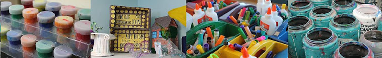
These spheres were glazed using Amaco's Opalescent glazes.  These glazes aren't necessarily meant for red glazes only, but they tend to have a cool effect if applied correctly to red bisqueware.  I couldn't find my Artist's Choice glazes (which are meant for red clay) to use so I went with these alternative glazes, which turned out pretty cool anyways.


In the future, I feel as if this project would definitely be better served as the first project in the ceramics unit not only because it's the easier hand-building skill, but because it would also be a good way to show students how glaze application affects the final outcome of the piece.  Next time, I would probably have students section off their design somehow and glaze each section differently: one layer, two layers, three layers, and a very sparse, splotchy layer.

Friday, March 7, 2014

Surrealist Landscapes

This is a project that was finished a while back during my maternity leave.  I had posted previously about the beginning of it and then the students finished it with my substitute.  I've only just now gotten around to photographing these and putting them up on Artsonia!

This project was done in alignment with the Common Core.  At the time, students were reading the fantasy novel Spiderwick, so I decided to do a surrealism project with them.  On the first day, I showed studenst examples of Salvador Dali's work, we talked about surrealism/fantasy art, and finally logged onto Switchzoo at the computer lab.  There, students played around and made three different hybrid fantasy animals.  I asked them to print off two animals: one they could keep and one that had to be handed in. At the end of class, I used the following exit slip with them:  At the bottom of your printed page, write your definition of surrealism.  Also, give your new animal an interesting name!

The next class, we looked at more examples of surrealist art.  We looked at floating landscapes, melting clocks, and many more using a Google search on the smartboard.  Then, I set them to work creating their own landscapes that had to incorporate their animal.  Students were also allowed to cut more images out of magazines to add.  The group who colored in pencil started with me, while the other class used marker with my substitute.  I don't really like to let them color with markers because it always looks so streaky, but they actually did a nice job with the markers!


Thursday, March 6, 2014

Roy G. Biv Collage Portraits

This is a project I did last year as part of my rainbow unit in 1st grade.  I liked it so much I decided to do it again with a few small tweeks.  You can view last year's project here.  This year, I split the project up into two days.  First, we reviewed the rainbow and colored some ROY G BIV bracelets.  After these were completed, I discussed portraiture with students.  We discussed what a portrait was versus a self-portrait.  I then asked them to close their eyes and envision Roy G. Biv living on his rainbow.  What would he look like?

For the rest of the period, students used markers to color Roy's head, minus the hair.  I put out four different skin colors of construction paper and allowed tables to get up, one at a time, to get their paper.  Last year, I ended up with all peach-toned Roys.  This year, I have a variety of skin tones, which is nice!

On the second day, we reviewed the rainbow and then added the hair to our Roys.  We glued everything onto a black background and voila!

It's always interesting to see the different face shapes...some use plain circles while others consciously recognize different face shapes!

Love the crazy hair and smile on the right one!

Love the crazy teeth and eyes on the right one!